Artwork preparation
How to prepare artwork for a domed sticker
File formats, 1:1 scale, safe margins, small text and backgrounds—a practical checklist before uploading artwork to the editor.
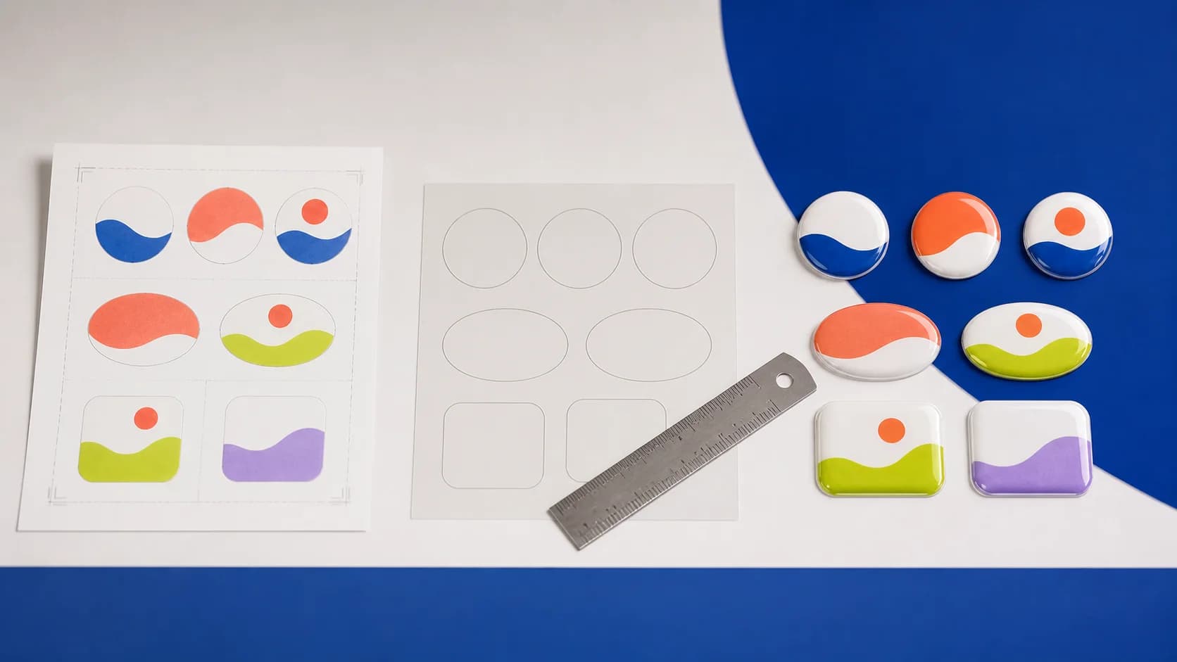
Domed sticker artwork goes through more stages than an image intended for a screen: it is printed, contour cut and covered with a clear polymer. The lens intensifies colour and highlights, but it can also make weak source quality, uneven edges and crowded composition more obvious. Preparation therefore starts with the exact physical dimensions.
The website accepts PNG, JPG, SVG and PDF files. A file extension does not guarantee quality: a raster image may be perfectly adequate, while a PDF may contain only a tiny embedded screenshot. Check the actual content, scale and behaviour of the image inside the selected shape.
Artwork is print-ready not when the file opens, but when every important element remains clear at the finished physical size.
The central preflight rule
Vector or raster?
A vector original—usually SVG or a correctly prepared PDF—is preferable for logos, icons and geometric marks. Its outlines can scale without pixelation and are easier to adapt. PNG and JPG are appropriate for photographs, textures and finished raster compositions when they contain enough pixels at final size.
Seven preparation steps
- Set the shape and size
Work in millimetres and respect the actual proportions of the circle, oval, square or rectangle.
- Extend the background
If the design should not show a white rim, the background needs to reach the edge with appropriate production allowance.
- Keep a safe margin
Do not place logos, words or QR codes against the contour; a calm inner margin protects important detail.
- Simplify small elements
Hairlines, tiny descriptors and complex gradients may disappear when reduced.
- Check contrast
A pale mark on a pale background and thin grey type will look weaker in print than on a bright display.
- Review at 1:1
Print a paper proof or calibrate the on-screen view to the correct physical size.
- Keep the editable source
Do not replace the working file with a single export; it will be needed if the dimensions or shape change.
Handling small text
The smaller the label, the less information it should carry. A brand name and short identifier are generally more useful than a full legal address. If text is essential, enlarge the product, strengthen the contrast and avoid ultra-light type. A paper proof quickly reveals the point at which a polished screen composition becomes unreadable.
Designing for the selected shape
A circle removes the corners of a rectangular layout, an oval expects a horizontal or vertical rhythm, and a long rectangle provides limited height. Never stretch a logo to fill the shape. Change the dimensions, add a controlled background or prepare a responsive logo version—perhaps the symbol without a long descriptor.
For custom contours, avoid thin bridges and needle-like projections. The liquid polymer forms an even lens through surface tension, so smoother geometry is more predictable. Even a recognisable silhouette may benefit from subtle simplification and rounding.
Final file check
- the shape and dimensions are defined in millimetres;
- logo proportions have not been distorted;
- critical elements are inset from the edge;
- raster artwork is not visibly pixelated at 1:1;
- the QR code scans from a printed proof;
- background and transparency behave as intended;
- an editable source file is safely retained.
If no suitable original exists, choose the design-preparation service and attach every available source with a clear brief. A designer can construct a technically cleaner file, but still needs accurate dimensions, the desired shape, the logo and an understanding of where the label will be applied.
How it looks

