Product choice
How to choose the shape and size of a domed sticker
Circle, oval, rounded square, rectangle or shield: choose geometry for the logo, object and viewing distance rather than taste alone.
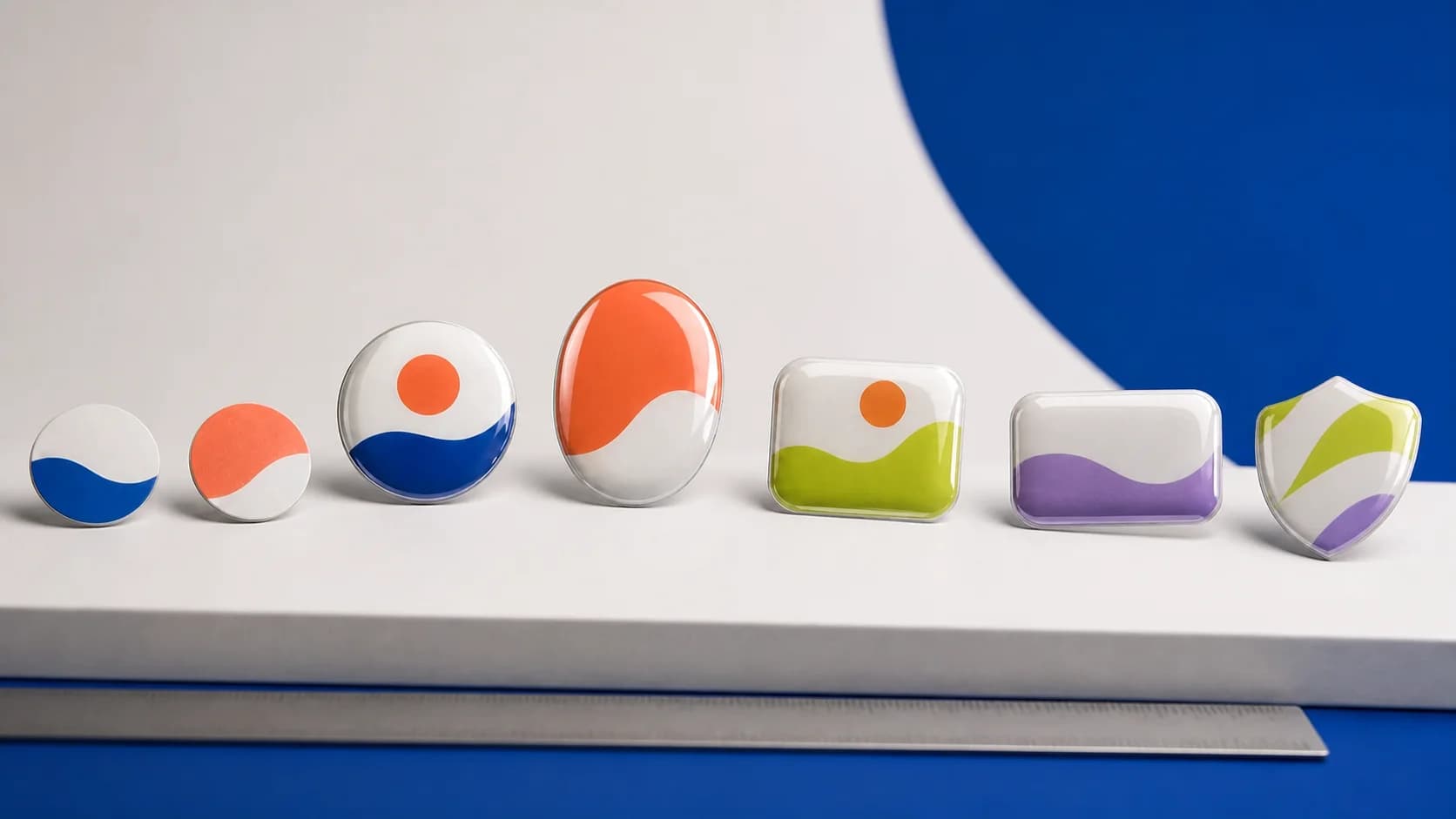
The shape of a domed sticker has three jobs: fit the object, support the logo composition and hold a smooth polymer lens. Size affects legibility, price and visual scale. The correct starting point is therefore the application area—not a habitual assumption such as ‘make it a 50 mm circle’.
Measure the clear flat area and decide how far away the mark will normally be viewed. A device label is examined closely, a tabletop QR code is scanned from farther away, and branding on a gift box is perceived as part of the entire packaging composition.
The right size keeps the mark legible, the object visually balanced and a deliberate area of breathing room around the label.
A simple selection criterion
When a circle works
A circle suits a compact symbol, monogram, icon or QR code with an adequate quiet zone. It works on buttons, lids, small boxes and cylindrical objects with modest curvature. A long name has to shrink dramatically inside a circle, making the shape a poor choice for many horizontal logos.
Why choose an oval
An oval retains a soft edge while offering extra horizontal or vertical space. It can suit names, emblems, coffee and cosmetic products, and small serial plates. Width and height are set independently in the editor; the logo itself should never be stretched to match them. Adjust the surrounding field instead.
Rounded squares and rectangles
A square is effective for app-like icons, compact symbols and QR codes. A rectangle supports a name, model reference, technical identifier or horizontal composition. Rounded corners are more than a style choice: a smooth contour helps the polymer form an even lens and avoids fragile pointed projections.
When a shield shape is appropriate
A shield supports emblems, club identity and unit insignia. For resin doming, the contour should remain smooth, without an extremely thin tip, narrow recesses or tiny teeth. Important elements belong within a calm central field.
Choose the dimensions in five steps
- Measure the area
Record the maximum width and height of the flat zone, excluding bevels, holes and moving parts.
- Retain an outer margin
Do not fill the entire area; a few millimetres of space visually separate the mark from the object edge.
- Make paper options
Print two or three neighbouring sizes and place them on the real object.
- Review the content
Check that names, fine lines and QR modules remain clear without magnification.
- Compare area and context
If two sizes look equally good, consider total area, price and application conditions before deciding.
Why very small labels are harder
Fine lines and internal space disappear faster in a small format, while the polymer lens has a stronger effect on detail. A compact dome label is still possible; it simply needs simpler artwork. A symbol, broad colour shapes and a short identifier perform better than dense information.
Check before production
- the contour fits a genuinely flat part of the object;
- the logo retains its original proportions;
- sharp points and thin projections have been simplified;
- text remains readable on a 1:1 paper proof;
- the QR code has been tested from its real scanning distance;
- the chosen dimensions work for both the artwork and the batch budget.
The editor lets you change dimensions while seeing the live proportions of the chosen shape. Use the screen preview for composition and a paper proof for physical scale. Together they are much more reliable than selecting a size by intuition alone.
How it looks

