Photo case
Oval Teamo domed labels: an archive photo case
A real PrintMarket production example: why an oval suits a wide logo, how a dark background behaves and what to check in small supporting text.
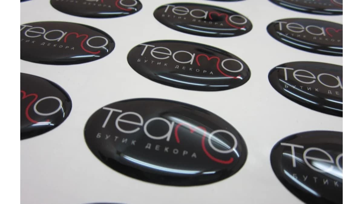
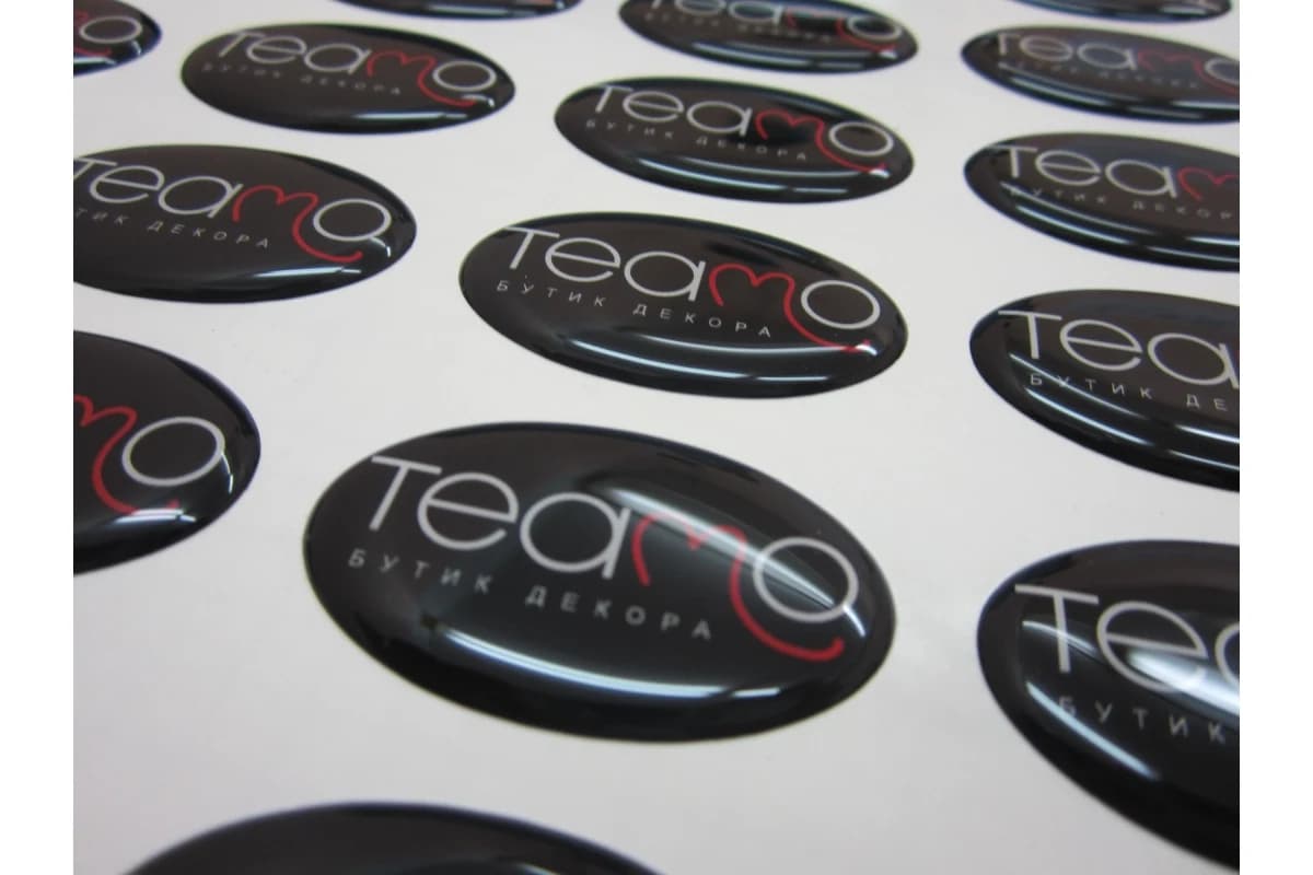
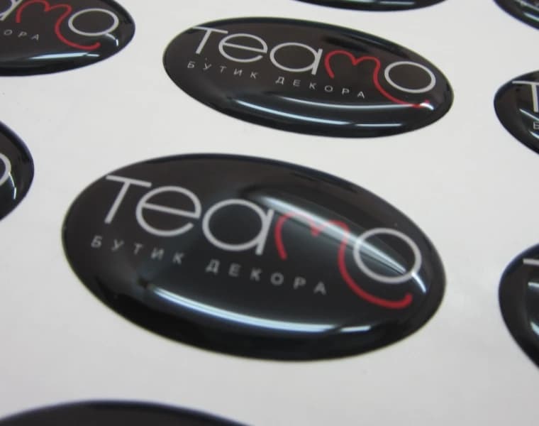
This is not a generated mock-up. It is an archive photograph of a completed PrintMarket production run. The sheet contains dark oval badges carrying the Teamo logo and a small home-decor boutique descriptor. The image is useful because it shows more than the flat artwork: it records real polymer-lens highlights, the soft edge and the sense of depth created over a black background.
Why an oval works for this logo
The Teamo wordmark is wide, with a small descriptor placed below it. A circle would either leave excessive empty space above and below the mark or force the lettering to become unnecessarily small. A rectangle would make the result feel more rigid. The oval follows the natural proportions of the composition, preserves breathing room around the mark and still reads as a finished product detail.
The same principle applies to other brands: choose a badge shape from the silhouette of the main mark rather than from habit. Wide names often work best in an oval or rounded rectangle, compact symbols fit a circle or square, and a custom contour only adds value when it meaningfully reinforces recognition.
A dark field, light lettering and one accent colour
The black field holds the logo elements together and gives the light lettering strong contrast. The red line inside the name remains a clear accent without competing with the wordmark. This restricted palette also handles polymer reflections well: when a bright highlight crosses the surface, the overall silhouette of the logo remains recognisable.
A black background is nevertheless demanding in print and artwork preparation. Changes in tone, insufficient ink density and unwanted edges around pale elements are more visible across a large dark area. Before production, the colour mode, effective raster resolution and any accidental transparency around the artwork should be checked carefully.
Small supporting text is the main risk
A thin descriptor sits below the name. It remains visible in the photograph, but elements like this are usually the first to lose definition when a badge is reduced. Letter height is only one factor: stroke width, character spacing, contrast and the polymer highlight all matter. Artwork should therefore be assessed at its real physical size, not only while enlarged on a monitor.
- print the outline and logo at 1:1 scale on ordinary paper;
- check the descriptor from a normal viewing distance rather than close up;
- do not use fine light lines as the only carrier of essential information;
- leave a deliberate safe margin between the logo and the edge;
- if the descriptor is unclear, enlarge the badge or simplify the second line.
What a production photograph shows better than a mock-up
A mock-up helps with shape and placement, while a real sheet reveals details absent from a flat file: the direction of reflections, the rounded edge, optical enlargement beneath the lens and visual differences between items near the centre and edge of the photograph. It also shows that finished badges remain separate products on a shared backing sheet, making them practical to store and apply over time.
How to build a similar result in the constructor
Choose the oval shape, measure the available area on the object and enter the physical dimensions in millimetres. Upload the logo, fit it with a sufficient inner safe area and review the quality messages. If the artwork contains a solid dark background, it must extend beyond the trim line by the required production bleed. After previewing the design, inspect the smallest text once more at 1:1 scale.
This archive example cannot replace testing a specific substrate and a specific file, but it demonstrates a sound design decision: the shape supports the brand proportions, contrast protects legibility and the polymer lens supplies depth without unnecessary decoration.
How it looks